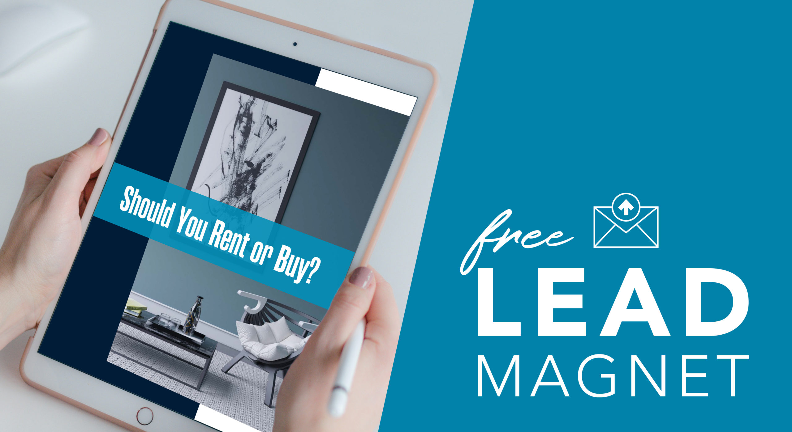
You don’t need no stinkin’ landing page!
That is, unless you want to convert more high-quality leads.
Too many real estate agents rely on their websites to attract leads, and yet across industries, websites don’t convert leads nearly as well as landing pages do. But you probably know that already; it’s why you’re reading this blog post.
Rest assured that if you’re looking to create a landing page and convert more high-quality leads, you’ve come to the right place.
In this blog post, you’ll get answers to the questions that agents who want to build their first landing page most often ask:
- How do landing pages work?
- What are the elements of a landing page?
- What do I need to know about landing page design?
- How do I set up a real estate landing page?
I’ll also provide you with some tips that will maximize your pages’ power to generate more leads that convert.
But before we get into that, you should know that building even a simple landing page is as much a technical task as it is a creative one—especially when it comes to tracking how your page performs. If you don’t have the necessary skills, don’t worry. A little later on I’ll provide some other options, including how you can get a free real estate landing page and done-for-you lead magnets.
How do landing pages work?
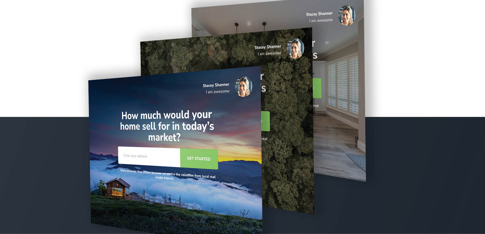
How a landing page works is pretty straightforward: through a pay-per-click ad or a call to action (CTA) in a blog, an email, or a social media post, you offer your audience an item of value called a lead magnet. They click the link you provide to obtain this item and “land” on your page, where they find a lead-capture form. They complete the form with their contact information, click submit, and receive the item either as a download or in an email.
It sounds simple enough, but whether you get the intended result is dependent on a large number of variables that quickly culminate in a click/no click decision: Does your audience believe that the value of the lead magnet is worth giving up their very precious and very personal information to acquire?
These highly influential variables are the elements included on your landing page and in the page’s overall design. Get either of them wrong, and you’ve lost a potential new client. The content and design tips that follow will make sure that doesn’t happen.
1. Keep the number of elements to a minimum
First and foremost, a landing page has only one goal: to capture a visitor’s contact information.
One reason why the best landing pages perform so well is because they have this singular purpose and are designed from beginning to end to support it. Try to make a landing page do more, and its ability to turn visitors into leads is diminished.
These are the essential elements of a high-converting landing page:
- A captivating main headline
- A supporting headline
- A single exceptionally clear and compelling CTA
- A lead-capture form
- A highly relevant image(s) or video
- A post-click thank you message
You do have the option to include other elements that can enhance the functionality and persuasive appeal of your real estate landing page. Test the effect of adding your unique selling proposition and the benefits of your offer. You might also use social proof, such as client testimonials, business credentials, earned media, or social media shares.
Because you need to focus visitors’ attention on your CTA, there are elements common to other web pages that you should remove from your landing pages, the most important of these being navigation. You want to keep your visitors’ eyes on the prize, so don’t tempt them to click away.
You also want to avoid including pop-ups, scroll-jacking (when you override the normal behavior of scroll bars), or a footer. Essentially, anything that distracts, impedes, or causes friction and stops someone from completing the CTA should be removed.
What to know about designing a real estate landing page
There is far more to know about designing a high-converting landing page than I could possibly include in a single article. After all, there are people who have degrees in this stuff and build entire careers around it. However, there is a simple fact that informs the tips below and can point you in the right direction when you are unsure about what to do: people don’t read landing pages—they scan them.
2. Write copy that is clear and persuasive
Aside from writing overall compelling and persuasive copy—an essential marketing skill in itself—there is certain copy on your landing page that you should give particular attention to:
- The landing page should have the same words you used in whatever email, ad, blog, or post that brought them to your page. The consistency will quickly assure them that they’ve landed in the right place.
- The main headline should be brief while your supporting headline acts as an extension or offers a significant benefit.
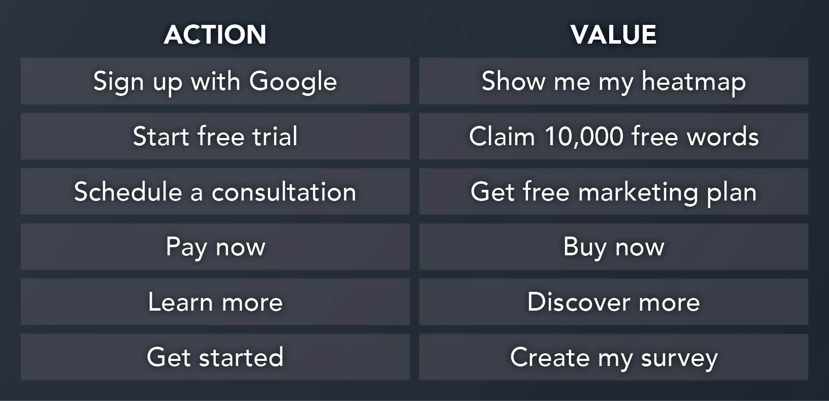
- The CTA should motivate people to take a desired action, and the best way to motivate someone is to lead with value.
3. Use space wisely
You may feel inclined to include as much information as you can on your landing page—avoid the temptation. Put too much information on a page, and you’ll overwhelm a potential lead.
Similarly, not using sufficient white space (the space between the elements on your page) will make your page appear crowded and unbalanced. Keep sentences short, and use bullets.
4. Include a single, obvious call to action
To reiterate: your primary goal is to have visitors to your landing page complete your CTA, so you want to make it as clear and prominent as possible. There are several ways you can accomplish this.
Include only one CTA. If you give page visitors too many options, they may do nothing at all. One CTA is easy to control and measure, there is less chance your visitors will be confused about their next steps, and you are more likely to get the contact information you want.
Use a contrasting color. The colors you select for your landing page should align with your brand and harmonize with the colors you use elsewhere, such as on your website. The consistency will reinforce the connection with your brand while increasing familiarity and trust. That said, you’ll want to use a contrasting color for your CTA so it stands out from all the other elements on the page and immediately draws visitors’ eyes to it.

Black, white, gray, and beige aren’t typically good color choices for a CTA button, but against this bright background, black works, and the size makes it stand out.
Add emphasis. You can use arrows, borders, and animation to draw attention to the CTA. A more subtle technique would be to include an image of someone looking in the direction of your CTA.
Place your CTA above the fold. You can test if positioning your CTA higher or lower or to the left or right produces better results, but always ensure that visitors don’t have to scroll down the page to see it.
5. Create a form and lead magnet that captures the leads you want
The prevailing belief is that the more information you ask a potential lead to provide, the greater the chance they will abandon the effort. However, if someone sees tremendous value in your lead magnet—such that they simply won’t rest until they have it—they may be willing to provide more details.
Think about this for a minute.
If you ask for only an email address, you may get more page visitors to convert, meaning you can collect a greater number of leads and add them to your drip campaigns. But those leads may not be well qualified.
On the other hand, if you ask for more information—let’s say an email address, plus a first and last name and a phone number—you may get less conversions. The trade-off is that the page visitors who do convert are more likely to be warmer leads because they were willing to provide more information.

If a from requests more information, you may get less conversions, but those who do convert are likely to be warmer leads.
In a similar way, the lead magnet you offer will also attract differently qualified leads. A guide to improving the curb appeal of a home will equally attract homeowners who want to spruce up their front yards for their own pleasure as it will home sellers who want to entice more potential buyers. In comparison, an e-book titled “What to Ask Before Buying A Home” is more likely to get the attention of prospects actively looking to purchase a home.
How much and what type of information you request and what type of lead magnet you offer should be determined by whether your goal is to amass as many leads as possible to add to a drip campaign or to gather more warm leads to follow up with immediately.
Setting up a real estate landing page
After writing and designing your landing page, the next step is to publish it so it’s available to your audience.
You want to optimize your page for SEO with the right title tags and a keyword-rich metadescription to ensure search engines will send traffic to it. Make sure, too, that its design is responsive (meaning it resizes to fit mobile devices).
The form you provide to visitors needs to connect with your CRM so you can capture and store the contact information given to you. And you want to be able to know how your page performs. Using Google Analytics, you can track and measure all pertinent metrics, including page views, time on page, conversion rate, bounce rate, and form abandonment.
Would you like help with your landing pages?
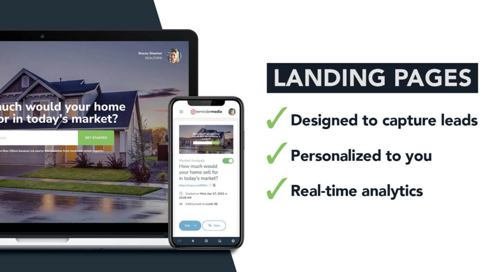
If you’re able to create your own landing pages, then this blog will start you down the right path. But not every real estate agent has the time to invest in the writing, designing, testing, and tracking it takes to put together a high-converting landing page. That’s why we’ve done the research, invested the time, and hired the talent to create landing pages proven to convert more real estate leads.
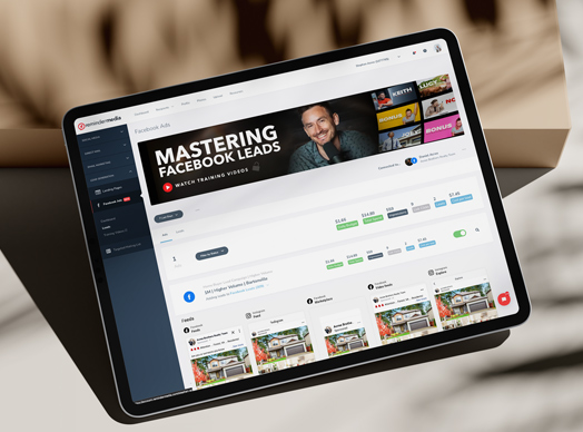
From our selection of landing pages, you can choose the ones that best fit your goals. Integrated with an easy-to-use dashboard, you can see the leads you are capturing and converting with data that is constantly updated. And because speed to lead is critical to your success, we notify you the moment a new lead comes in so you can follow up immediately.
Visit our website and see how effortless it can be to generate profitable new leads.
Claim these free bonus items!
If you’re interested in test-driving one of our landing pages, we’ll give you one at no cost when you place your order for postcards, AND we’ll give you 25 free postcards to boot! We’ll print your postcards with a QR code that links directly to your landing page, giving prospects an immediate and easy way to connect with you.
Finally, regardless of whether you use our landing pages, we have a library of high-value, irresistible, free lead magnets that you can download and use however and as often as you wish.




 Apple Podcasts
 Google Play
 Spotify

