When it comes to real estate, graphic design is an important aspect of marketing. From logos to print materials, a high-quality design can take your brand to the next level. However, for many (including myself), creating the type of design that exudes professionalism without requiring a lot of skill or time can feel like a beast that can’t be tamed.
To provide a few basic tips and tricks to help even the most inexperienced creators, we’ve enlisted the help of the creative masters behind our design team—the same ones who design our personally branded magazines, postcards, client ads, and so much more.
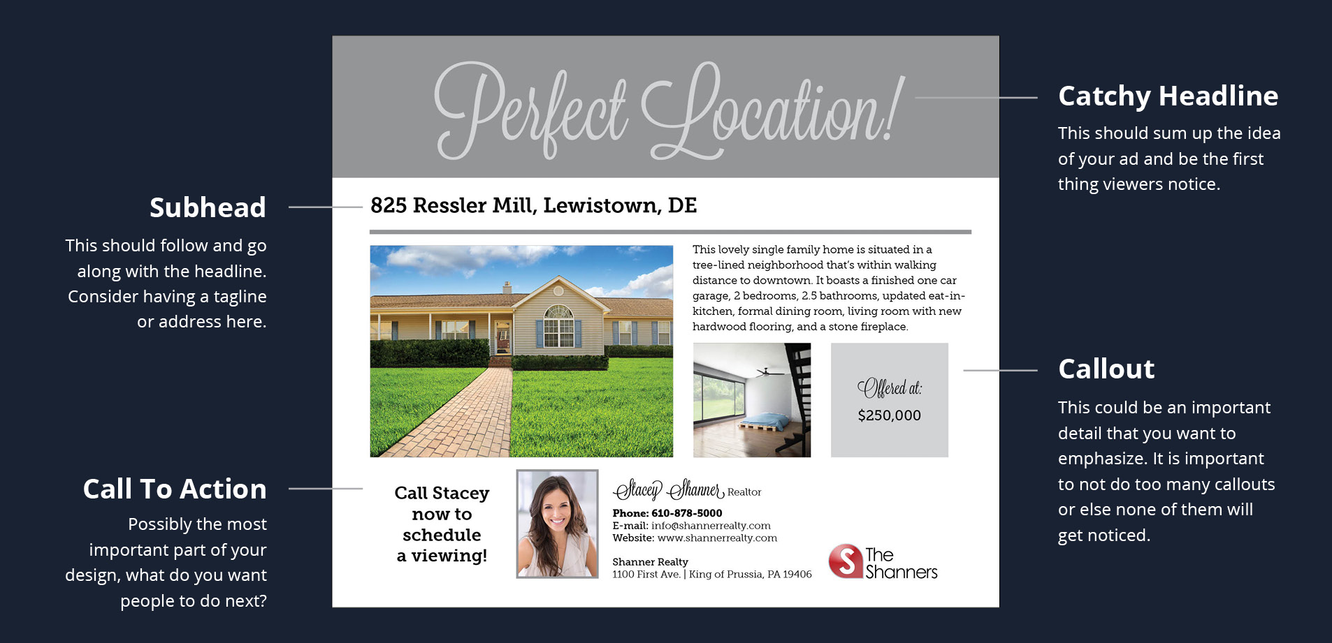
1. Organize your design around your call to action
This is simply what you want your ad to showcase. Like any other marketing piece, you must know the objective of the design before you begin. What do you hope to gain from the design? For example, if it’s a listing ad, your goal is to book as many showings as possible. Understanding the objective will help you identify your call to action. Showings involve prospects reaching out to you, so a strong call to action would be “Call me to schedule an appointment.” It’s also important to note that there should never be more than one call to action in any piece of marketing; any more and you can confuse a viewer, deterring them from taking appropriate action.
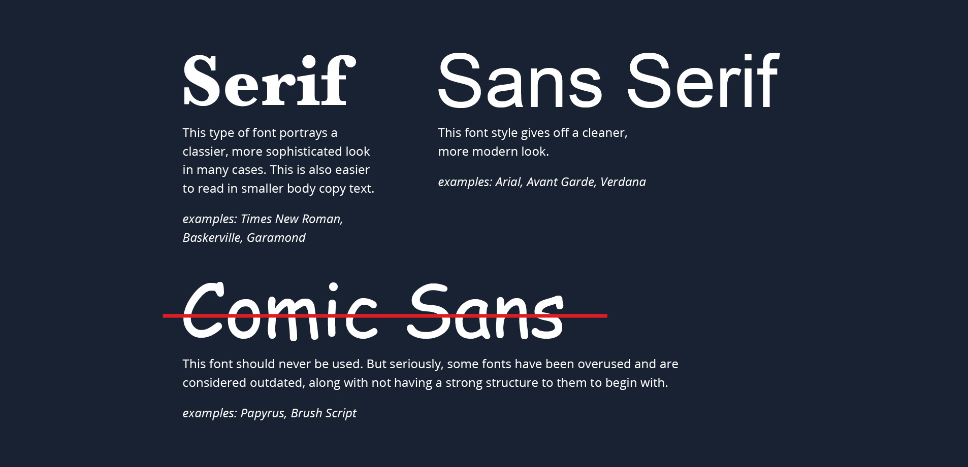
2. Keep fonts simple
For starters, avoid using more than three fonts in one ad. (Avoid Comic Sans for its reputation as immature and inappropriate for professional advertising.) More importantly, select a font that makes sense for the type of design that you envision. For example, a Serif font—think Times New Roman or any font with “feet”—typically looks more sophisticated and would work well for a luxury home listing. Lastly, don’t abuse bolding; use it only for the most important copy.
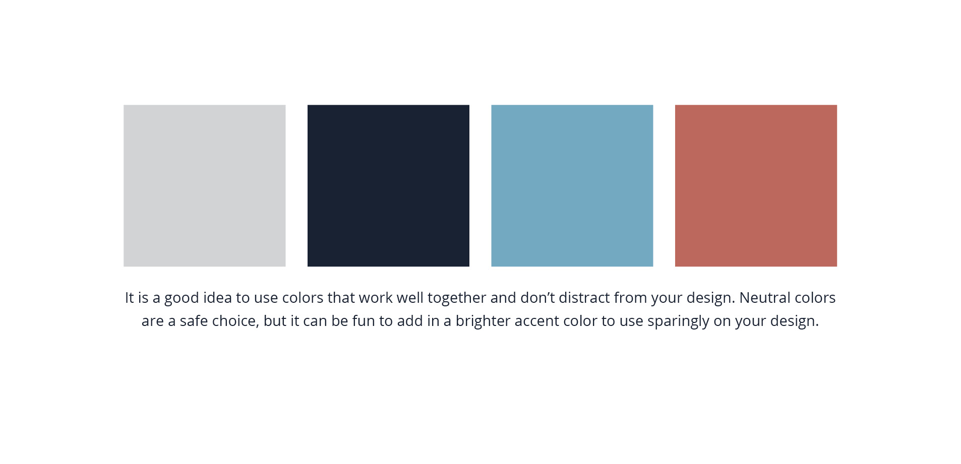
3. Don’t overwhelm them with color
It’s best to refrain from using too many colors in your design. A simple, clean design is typically more visually appealing and effective. Gear your design towards your brand. If you want prospects to perceive you as a high-quality agent, stick to neutral tones and sophisticated fonts. Also, don’t be afraid to utilize white space. If an ad is too cluttered, viewers might not know what to focus on, and ultimately distract them from honing in on the important elements of the ad.
Still a bit intimidated?
If designing your own print piece still seems a little intimidating, not to worry. Our talented Creative Services department can help you design a winning marketing piece to garner the type of attention that your brand deserves. Click the link, and check us out.


