


 Spotify


“When you’re finished changing, you’re finished.”
–Benjamin Franklin
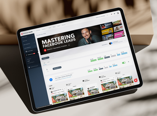
You may start noticing some changes to our look (starting with our logo) over the next few months. This is more than just a new logo, though. We truly see this this as new era for ReminderMedia. Committed to your success as a business owner, a salesperson, or a professional service provider, we are making major changes to our application as well as our product offerings, but we’ll get into that more in the upcoming months! For now, we wanted to show off our new threads, tell you a little bit about the process, and most important, why we did it.
Working primarily in the print industry for more than a decade, we’ve used the same logo and identity for the last 8 years. As we begin to provide more digital products, and focus on online experiences for our customers, we needed a logo that could catch up to the times. The previous logo worked at pretty much one size. Too large, it wasn’t strong enough; too small, and it became illegible.
What hasn’t changed:
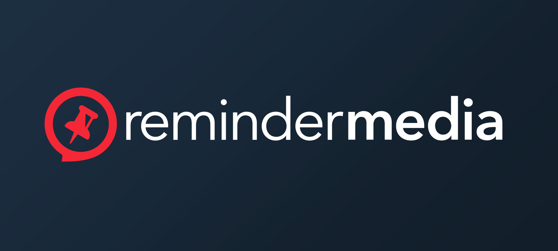
Our name. We feel that ReminderMedia says it all and cuts to the core of our mission: helping our clients be remembered so they can earn more business and close more deals. The media part has always been a little one-note for us, but not anymore. After the release of our digital edition, we realized that you are hungry for more marketing tools in your toolbox. This includes social media, e-mail marketing, and even more print products. We hope you love—and more importantly, that your clients love—the quality ReminderMedia represents and, in turn, your brand represents when you personalize that content. ReminderMedia is here to stay.
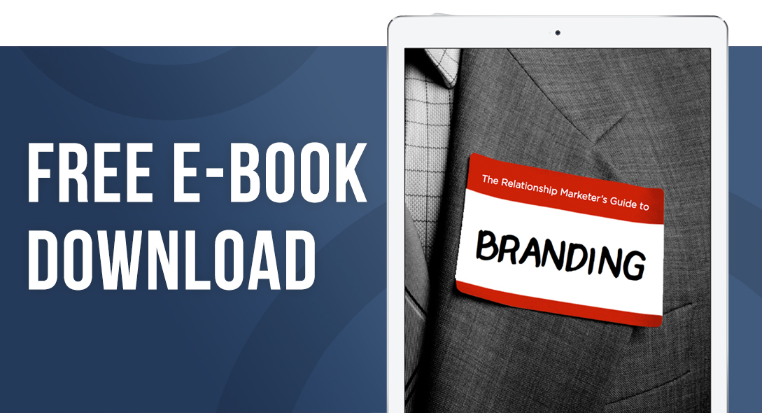
The pin. The pin makes a reappearance in our new logo, but in a much bolder style. During the discovery process of redesigning our logo, we learned that even some of our own employees didn’t know that it was was a pushpin! Share with us on Facebook what you thought it was. » This symbol is so important to us because it represents a couple of things. 1) A pushpin is an intuitive and natural way to remember things. You have something you want to be visually reminded of, you stick it on your cork board (or straight in the office drywall in my case) to remind you later. 2) A pushpin is sticky. Not like post-it note sticky, but literally it sticks in things. This is the kind of mindset we take when creating marketing. It has to be sticky to be remembered.
The colors (for the most part). We love the color red. In color theory, red is a very emotionally intense color. It’s associated with strength, power, and determination. These are the qualities that we value at ReminderMedia. Red is also used when you want to get someone’s attention—think STOP signs. This is the kind of attention that we want our customers to get when marketing to their clients.
So, what has changed?
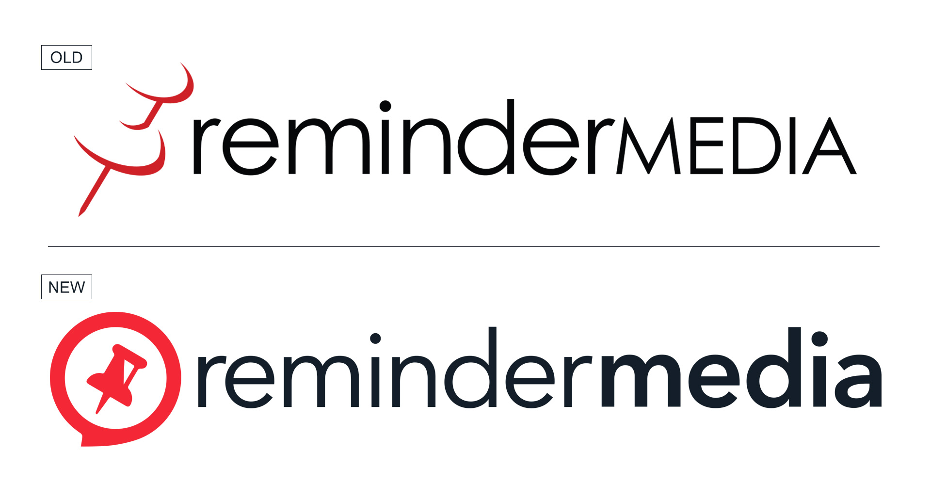
This part is pretty obvious, but our brand mark (the pin) is the biggest change. As we began mocking up digital versions of our new applications, it became painfully clear that our current pin was not strong enough on its own at small sizes (like mobile app badges). It was too thin and didn’t have anything grounding it without the logotype. The addition of the circle around the new pin has just the hint of a speech bubble that not only gives the symbol some weight, but also throws in the added bonus of another benefit ReminderMedia products provide—the ability to start a conversation with clients through this marketing. The angle of the pin remains tilted in a forward direction, implying action and constant motion—two things you have to be doing to be successful in marketing today.
Overall, we’re thrilled with how the new logo came out and can’t wait to hear your thoughts. A huge shout-out to our internal creative team that worked on putting this together and tore through pages of sketchbooks in the process. Keep a look-out for this change on our website, social media pages, and e-mails, coming soon!