Include these five elements on your landing pages to not only capture lead contact information but also close more deals
In the online marketing world, a landing page is a page that a visitor is brought to after clicking on an ad. The primary focus of a landing page is to capture lead contact information. However, creating an A+ landing page can often be tricky and require a few rounds of tweaks. Ensuring that your landing page includes the five elements discussed below can steer in you in the right direction—and ultimately help you close more deals.
Less is more
Fun fact—a landing page should not include as much content as a homepage. A cluttered landing page can often lead to a distracted and overwhelmed visitor. It’s better to keep text and images simple and to the point. Text should be easy to read, and the images should be relevant. A basic design will help visitors stay on track and remember why they clicked in the first place.
Compelling copy
You only have a few seconds to capture a visitor’s attention. Therefore, your copy needs to be short but mighty. Focus on the three main aspects of text—the headline, subhead, and body. Your headline should be well-defined and prominent. Subheads should be spread throughout the page, allowing visitors to skim. Avoid long bodies of text. Keep in mind that often visitors have short attention spans, so more isn’t always better.
Effective call to action
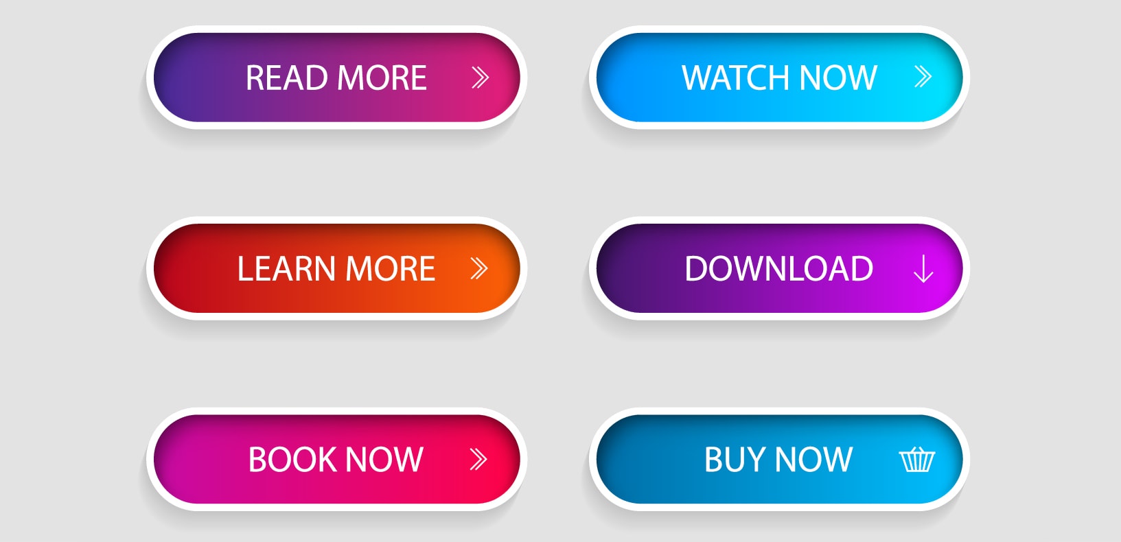
It can be a tricky game to get visitors to act. With a call to action button, sometimes it isn’t what you say but how you say it. For instance, instead of having a button that says “sign up now,” consider changing it so it reads “sign up now to get more referrals.” Use specific verbiage that offers value and makes it seem beneficial for visitors to sign up. They’ll be more compelled to give you their contact information if they believe that they’re receiving some sort of value in return.
Social proof
Testimonials improve credibility and build trust. Including testimonials on your landing page can persuade visitors who are unsure of moving forward to take the plunge. If well-known companies use your services, consider including their logos. If you have various client testimonials, pick a few of the best, and create a designated section for them. However, be mindful of the number of testimonials you select; you don’t want it to seem excessive and redundant.
Social sharing
Let’s face it: social media is big. More than likely, your visitors utilize at least one platform. Consider including shareable social media icons at the bottom of your landing page. This will allow visitors to share your page’s content on their social accounts (e.g. Facebook, LinkedIn, and Reddit). The more shares, the more exposure for your brand. This could even lead to increased traffic to your landing page and garner additional leads.
Before you create your next landing page, stop to make sure that the above elements are included. You’d be surprised at how much of a difference they can make!


